Over xG
Stats in football are very fashionable right now and what used to be the domain of nerds is now mainstream. As an example, when I watch a Bundesliga game, I see average position maps and numbers popping up to describe how good chances are. The numbers that appear are what are typically called ‘xG’ an acronym for expected goals.
What is xG?
xG is an attempt to put a percentage value on each shot to describe how likely it is to score. This is interesting because it casts light on things which can’t easily be quantified such as which team created the better chances and deserved to win.
I have some history with xG. Initially I loved it and I was absolutely blown away by the ability to quantify performances in objective ways but I don’t care so much for it now, let me explain.
Using it to analyse matches
Some time ago, I came across an xG model on the internet and I hooked it up to a web page which allowed me to draw shots on a 442 Magazine “Stats Zone” (remember that?) background and calculate the xG for each shot. If I recorded the shots for and against the junior football team I coach then I could analyse what a fair outcome of a game might be. Here’s one of the last games I recorded shots for, over two years ago:

The output, aside from a pleasant looking shots map is a cumulative chart of xG over the course of the game, which looked like this:

You can see from the chart that my team, in yellow, got a total xG over the course of the game of 3 and our opponents, in pink, totalled 1.5 xG.
Inspired by Danny Page’s Match Simulator I could then simulate games with these shots ten thousand times and see how many we would win, draw and lose.

Why I gave up with xG
I found xG very useful, it helped me to consider that the aim of a football team should be to create better chances than you concede. But what does a good chance look like? Around this time a boy turned up to play for my junior football team and the lad is a phenomenal footballer. He showed me what good chances are. I continued to feed the shot data into my xG analysis apps but I became increasingly disenchanted with what the apps were telling me. The xG model was claiming fantastic chances were something like 15-20% chances. We were making great chances and giving up chances which were difficult to score from. The numbers coming out of my xG model looked very different from what I think the reality was. I grew tired of the effort involved and almost always I found myself commenting on the computations along the lines of “the model massively under-estimates the quality of our chances”. I don’t run this kind of analysis any more.
What xG actually is
Let’s step back a bit and consider how the xG sausage is made. The model I was using, found on the internet, was made by scooping up lots of shot data, including where shots were taken from, the part of the body used (foot or head) and the outcome (goal or no goal), so based on the data you can say that a shot from a particular location taken with the foot results in a goal a certain percentage of the time. What’s so wrong with this? Lets come up with real, if naive, model and a few imaginary models to help highlight the problem I have with xG models.
A naive xG model
If you go to whoscored.com you can see season totals of goals and shots for each club broken down by shot location, in so far as shots are recorded as coming from within the six yard box, inside the penalty box or outside.
I looked at the 2019/20 Premier League season data and saw that there were 9396 shots, 3300 shots from outside the penalty box, 5282 shots inside the penalty box and 814 in the six yard box. From these shots there were 1002 goals, 124 from outside the box, 657 inside the penalty box and 221 inside the six yard box.
From this we can create a very basic xG model using simple mathematics – my favourite kind.
From outside the box: 124 goals from 3300 shots means that a shot from outside the box scores 3.76% of the time.
Inside the box: 657 goals from 5282 shots = 12.4%.
Closer to goal, within the six yard box: 221 goals from 814 shots = 27.1%
Let’s call this model, Model A. It’s intuitively absurd as a model because it treats all shots from within the penalty box as the same. They are obviously not the same. There are good chances in the penalty box and much less good chances – the model averages them all out and gives you the average value of a chance from within the penalty box. In aggregate – over the course of a season, this model is fine, the overall number of goals scored will more or less match what the model predicted. However, every value it puts on a shot, well a stopped clock is right twice a day, is going to be wrong a lot of the time. A model can be correct in the aggregate and just plain wrong for almost all of the individual shots.
Comparing my naive model to reality
Using Model A’s predictions of how many goals each team in the Premier League 2019/20 should have scored and comparing it to how many goals they did actually score, we observe the following: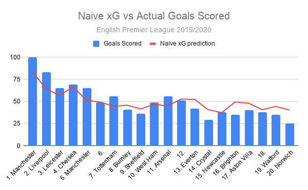
It’s tricky to read the chart and understand so I will describe what is happening. At the top of the league, Manchester City scored 100, 17 more than the 83 my xG model predicted. In second, Liverpool scored 18 more. In tenth place, West Ham scored 2 more than my model expected, and down at the bottom, in 20th place Norwich scored 15 fewer than my model forecast.
This model is noticeably under-estimating the chances that good teams, such as Manchester City and Liverpool, create. It also over-estimates the chances that poor teams create, Norwich scored 25 when expected to get 40, 60% more. Sixty percent! That is off by a lot.
It’s maybe not a surprise that a very unintelligent model isn’t very good. The values it puts on chances made by the good teams are noticeably off and the values it puts on chances made by poor teams are wildly out of kilter.
Imagine a less naive xG model, Model B, which is fine in the sense that like Model A just outlined it predicts the amount of goals scored from a large set of shots, and lets say that the biases between over-estimating bad chances and under-estimating good shots even each other out so that in a game between a good team that makes 10 good chances and a bad team that creates 10 bad chances, the total xG between the two teams correctly represents the amount of goals that should have been scored.
Finally, imagine an xG model, Model C, again perfectly predicting the amount of goals scored over a number of seasons, but also capturing all relevant information relating to the shot: for example, the spin on the ball, the prevailing wind, the position of all the players, which foot the goalkeeper’s weight is on, the shooter’s preferred foot and so on. This model is perfectly correct in the aggregate simply because it is perfectly correct for each and every individual shot.
Which of these models are the ones in use today? A, B or C? I see a lot of people on the internet making claims that could only be true if xG models are like C. Are the models like C?
As an example, the xG model used for Bundesliga broadcasts apparently demonstrates the flaws of Model A and yet is described as if it was Model C.
“An example: FC Bayern München have an xG of 20.2 in the current season. But Hansi Flick’s side have actually scored 34 goals, 14 more than would have been expected given their attempts at goal. This major discrepancy between xG and actual goals scored is by far the biggest in the Bundesliga. In other words, Bayern also score from seemingly impossible situations.”
Having watched quite a bit of Bayern that season my recollection is that they actually don’t “score from seemingly impossible situations”. The opposite is true, they score a lot of mundane goals, plus tap-ins or what my son would call “sweatties”. The model used for Bundesliga broadcasts demonstrates the same flaws as Model A, and yet it is presented as if it is Model C.
I have read that the Stats Bomb xG model is one of the finest around. I am talking beyond my experience in the sense that I have not used it nor do I know what other models are like. Anyway, if you accept that the Stats Bomb model is the best then this suggests that current xG models demonstrate the same flaws. We can see the Stats Bomb model in action on FBRef and at the time of writing, the league table looks like this:
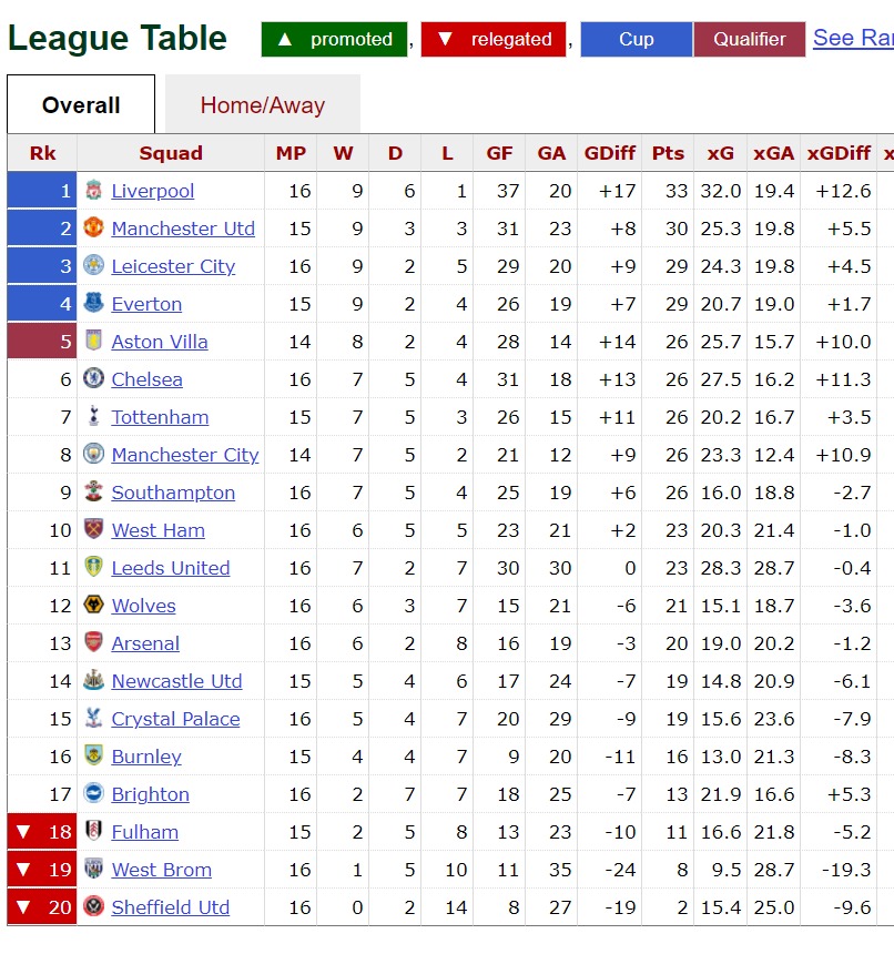
The biases are extremely marked, at the top Liverpool have scored 5 goals more than the model predicts and Manchester United have scored 6 more. Down at the bottom, hapless Sheffield United have scored 8 against a prediction of 15 – 87.5% more than they got.
What this indicates to me is that xG models at the time of writing are actually not that good, they are nowhere near Model C and exhibit the same flaws as the very basic, simple model I came up with earlier.
Final thoughts
It may well be that the difference in ability in junior football teams is much greater than the difference between Norwich and Liverpool, and applying a model based on professional football to junior football is not going to produce accurate results. That said my own experience is that xG models under-estimate good teams – I gave up using a reasonable model, which was much better than Model A but worse than the Stats Bomb one, for my own junior football team because I was so consistently dissatisfied with the output. Maybe if I was an analyst for Liverpool then the degree of error would be smaller and less irritating.
“All models are wrong but some models are useful.” – George Box
I found xG useful, it helped me think about the types of chances that my team should try to create. Even Model A tells you that shooting from outside the box is a mug’s game and you can boost your chances of scoring by up to 400%(!) by getting into the box. Even if your team isn’t great at getting the ball into the box, it’s probably worth trying given the size of the pay-off.
Because good teams outscore their xG, you can conclude from this that good teams create good chances. If you want to have a good team you need to coach that team to create good chances. If good teams didn’t outscore their xG you could conclude that good teams just shoot more often. You can see this effect even with Model A. The simplest model does have some use.
Where I didn’t find xG useful was the value it puts on individual chances. Knowing the average value of a ‘similar’ chance is what xG models tell you, rather than the actual value of an individual chance. That’s not really I want to know, and yet that’s what Models A, B and apparently even the best models tell me. You can use xG as a basis to create objective performance analysis of individual play and yet if you do this your output will contain the same problems as xG does, it will under-estimate good players and over-estimate bad players. I wonder if some clubs are already falling for this by buying players from poor teams because they have systems that overrate them.
I will watch the Bundesliga broadcasts with interest to see when they put the xG values up on screen, if they only put them up for good chances then the values they display will always be wrong.
If you didn’t find this very convincing you may have more luck with these more technical posts: A discussion of the same ideas with a technical discussion of the Stats Bomb model and the problem is hinted at in this discussion if you look at the graphs and charts.